Bedtime Terrors: Postmortem
Introduction
To begin with, the project required us to create a reality-defying Virtual Reality experience/game in which the player could experience and do things that you normally could not do in traditional PC games. Furthermore, within the game, the player had to be able to interact with their environment; whether it is to pick up objects or pull open drawers, the player had to somehow use their hands to perform actions that affect the world around them.
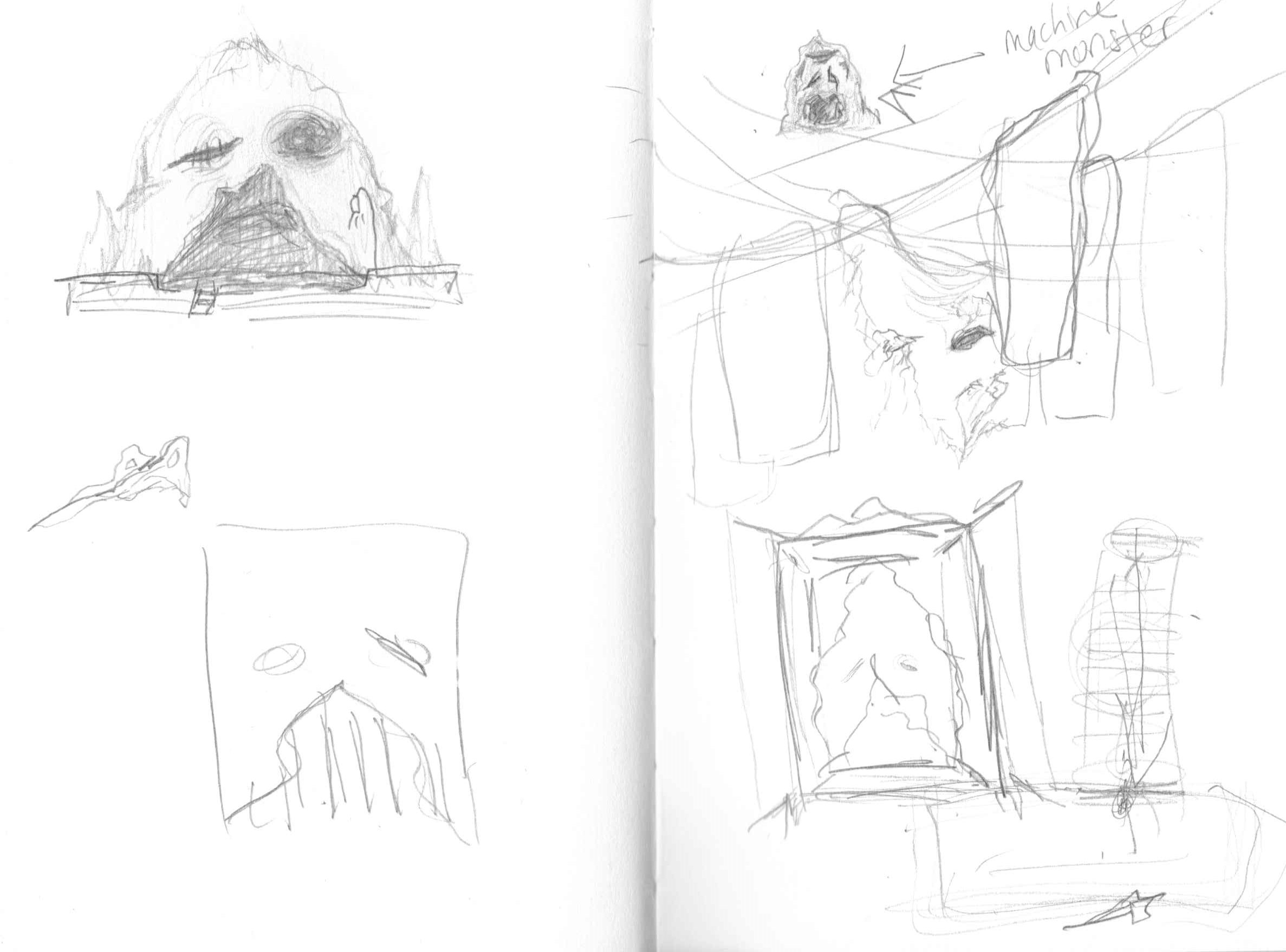
In terms of the concept, our brainstorming led us to consider the idea of what a small child considers to be behind their closet doors, like monsters or other terrors, at night while they try to sleep. As such, we decided to take this concept, along with other inspirations including Playdead’s Inside, Little Nightmares, Layers of Fear and the paintings of Hieronymus Bosch, and create an atmospheric, puzzle-based VR game. Indeed, within the game, the player has to navigate through the eerie environment behind the closet doors to find clues that will help solve the puzzle of the locked door, allowing them to escape back to reality.
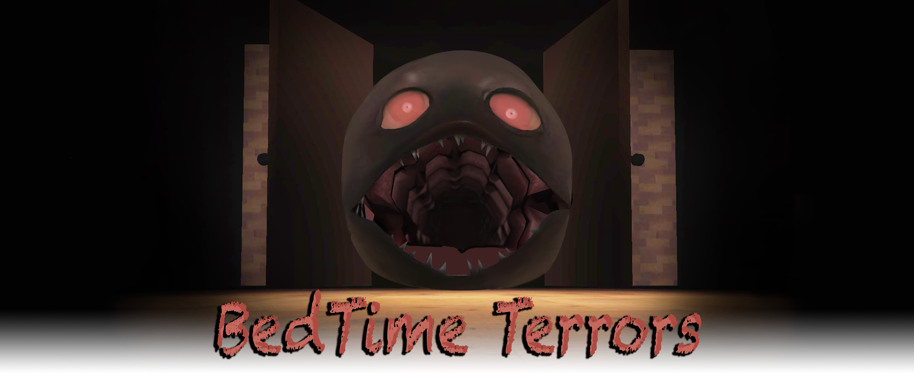
With this concept in mind, our group decided to create a bare room which only leads into the open mouth of the closet door monster, giving the player no choice but to move forward and into its throat. After ascending a plank, the player then finds themselves in a larger-than-life attic room where their interactions with the environment yield various items, such as scissors and the monster’s eyeball, which are necessary to unlock the locked mouth which leads out of the nightmare.

Continuing, everyone in the group contributed to the environment elements within the game, as well as the animations, although Justina and Jib had a more prominent role in animation work. Costas was more focused on the level design of the game as well as taking notes during playtests and hearing what playtesters thought of the game, while also helping out with the programming tasks. Justina was focused on 3D modeling as well as the core programming of the game. Furthermore, she fulfilled the role of Manager for the project. Jib also worked on 3D modeling as well as the UV work for the models. She was also the Producer of the project. Finally, You Jin focused on 3D modeling as well as the audio and sounds of the game.
What Went Right (5 things)
One of the initial goals that worked well was the atmosphere of the game. Our intention was to create an eerie, nightmarish atmosphere through manipulating the environment around the player, from the lighting to the sounds. With that, we added ambient sounds as the BGM that changed from room to room, and also included sound effects that would enhance the atmospheric effect when combined with the animation. One example of this would be when the first door opens very slowly with a long creaking sound to create an unsettling feeling for the player. Throughout the playtest, the playtesters were reacting to the sounds as they progressed through the game.
In addition to the sounds, the lighting also contributed to making the game very atmospheric. After several iterations and playing with the colors, the brightness level, and the different types of lighting, we were able to create a creepy atmosphere that fitted with our theme and story. Overall, the final version of the lighting is dark and foggy with a warm, yellowish tint, allowing the player to only see within a certain distance around them. Having a dark atmosphere didn’t only convey the ominous theme, but it also allowed us to use brighter lighting in certain spots as an indication to hint how the player could proceed through the game. One example of this would be the desk at the end of the room where two of the main items were placed. The desk has a glowing light bulb over it, and therefore, the players were drawn towards the desk.
Another aspect that went smoothly was 3D-modeling. We were able to have all the models, from the key items, to the environment and the decorations finished and ready to be put into Unity fairly early in the making process. This made it very easy to design and see how the rooms should actually look like in the game, as well as how to design the lighting and sounds so that the overall aesthetic can be coherent. Additionally, having the models ready early on also allowed more room for mistakes and the time to fix them later on in our process. Although we realized that the models have too many polygons that slowed down the game, we were able to fix the issue fairly quickly because the files were already there so we just went back to the models’ earlier versions. If we learned about the polygons problem a week later because the models were only finished then, it would have been a bigger issue changing all of the models with the deadline coming up so soon. The same goes for the interaction. Since we had the models early, we were able to plan the interactions with the actual models and test out how they would behave in the game. This was very important for mechanics such as the snapping that we chose to use, because it required the objects of the exact shape to make the snapping zone, and having the actual models readily available saved us time from going back and forth to swap between the real models and the test models.


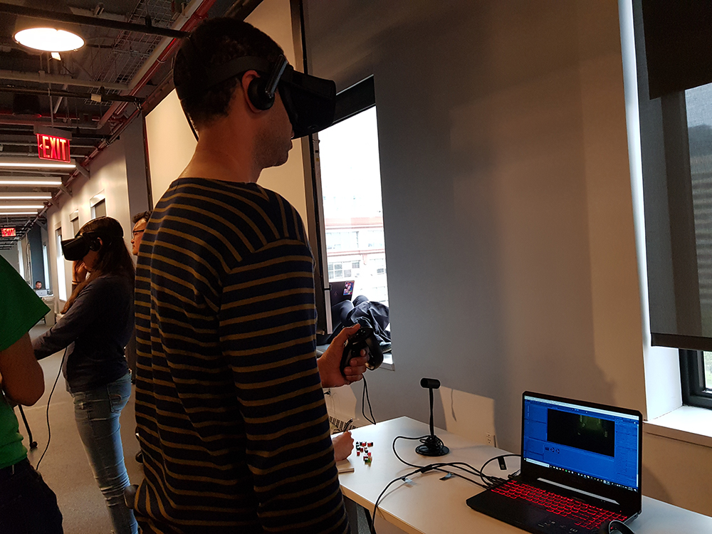
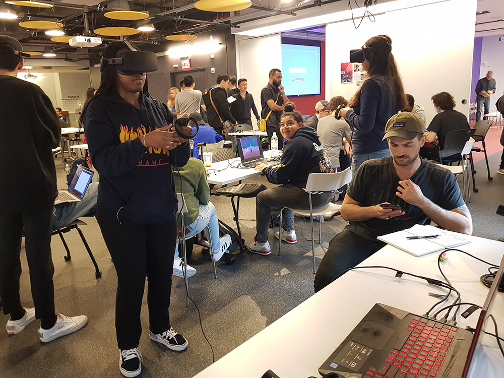
We were successful in being able to finish the different versions of the game to be playtested every time there was a playtest. This is very crucial to improving the game, because we were able to receive feedback regarding the atmosphere, interactions, and whether or not the game gave the players motion sickness. During Playtest Thursday at the NYU Game Center, although with some technical difficulty at the start, we were able to have the game tested by many people outside of The New School and receive many useful comments on different aspects of the game. The playtest went very smoothly, with playtesters of various ages trying out the game. Moreover, we were able to observe the immediate reactions of the players whilst playing the game, as well as other reactions from people as they stopped to watch, which suggested that the game was visually interesting enough and caught their attention.
Aside from the aforementioned technical successes, the communication within the group was also something that went well. We were able to organize weekly meetings with every member present, as well as communicating, organizing and sharing our workloads online. Every member took part in sharing ideas and solving problems from the first day of brainstorming up until the final version of the project. The tasks assigned were finished on time and every member was reachable and responsive via online communication. We were able to successfully achieved all of our goals, whether the ones that went smoothly or with some problems that required us to take some time to look into, due to the fact that the communication within the group went smoothly.
What Went Wrong (5 things)
One of the first challenges we encountered was using and connecting the VR set. Setting up the VR and using it took time and was a very tedious process. If we were to change something within Unity we would have to set up the headset to check if it would work or not and repeat this process over and over again. Another thing that made VR a challenge was that since there was only one VR headset we all had to find time to meet up and work together on Unity, to discuss what to do and what can be done for our game.
Another challenge was implementing hands into our game. We wanted hands in our game in order to present the action of picking up objects. The issue of implementing hands was that the hands wouldn’t scale properly with the character and would often either be too high or too low from the player. This height issue also caused problems with our collectible objects, resulting in players not being able to pick up objects because the objects were too low or too big to be able to be picked up. This is still an issue in our game as when you drop objects to the ground they can be difficult to pick up because they are too low and the hand(s) seemingly gets stuck in the floor.
Motion sickness was also an issue with our game. We wanted the player to be able to move fast throughout our environment but because our environment was so big compared to the player we had to increase the speed. This increased speed wasn’t noticeable until the player gets to the ramp or if they got to the desk at the far end of the room. The speed at those points was noticeable because of how small those objects were compared to the rest of the scene. Through playtesting we also found that if the player were to turn around and move forward with the controller, the player would actually move backwards because the rotation in the game isn’t updated or connected with the rotation of the VR headset meaning the player can’t move forward based on the direction they face. As a result, when players got to the end of the room they wouldn’t be able to go back because going backwards was very disorienting. Thus, we changed the movement of the player from move speed to teleportation but this also created problems as it took away from the mood of the environment. The teleportation later also created a problem of jittering up and down when the player would try to teleport near the desk.
Another issue was that the path that the player takes is very linear. Originally we thought that the big room would give player an incentive to look around the area but instead, we noticed that most of the time the direction players choose to go was straight. By going straight they reached the desk and were able to continue with the game but there wasn’t much exploration. It probably would have been better to place the desk somewhere else and draw the player's attention to either the right or left with noise or light. The hallway could have also been less linear and more of a winding path for the player to walk through.
Knowing what to do in our game was also an issue. Players understand that a door closes behind them but they don’t know that it can be opened. So the player moves forward and gets to the desk, from then on they can get confused on how to continue. The missing pieces from the ragdoll could have been more noticeable such as taking a bigger piece off from the ragdoll model since the ragdoll is also very small. Once completing the task the player would obtain the eye and be uncertain of where to go and what to do next. With that in mind, the animation of the character model ended with the hand pointing back to the door and an knocking audio was also added that the player would understand that they would have to go back to the door. There was also another issue where once the player goes back to the door they would try to climb the face to put the eye in. It is only until they see the eye or we would have to tell them that the eye can’t go in until the strings are cut. At the time when the door closes, we could have added more animation for the eye getting closed by string and the mouth getting closed by chains to show the player that something is needed to break that.
What We Learned
Overall, we learned how to create and incorporate numerous mechanics within a VR game/experience in Unity using various assets such as VRTK (Virtual Reality Took Kit) and Pro-Builder. Unlike 3D or 2D games, this project taught us to consider the player’s movement and the correlation between interactive pieces and the player.
As we mentioned above, we first incorporated vector movements and it created motion sickness especially for the players with less or no experiences with VR games. Therefore, we realized that point and click (teleport) movement reduced the dizziness. However, as aforementioned, certain users commented that this method decreases the user experience because the jump between one place to another is huge, which resulted in the players missing the opportunity to look at the surrounding environments. If we are continuing the project with vector movement, we will set the stopping places/focal stations within certain distances that are short enough for the player so they can reach them before they feel sick. This way, the game can have more interactions and puzzles for the players to solve and utilize all the space there is to explore.
For this project, we had to organize many playtest sessions, to inspect if the small changes we did were working or not. For example, were the players able to grab the objects without any trouble? Was the environment too dark or too bright? Was the audio appropriate for the game’s atmosphere? As a result, this task has taught us the importance of organizing group meetings and finishing the task on time because we only had one Oculus set to examine our iterations and we required many playtest hours to make sure that everything was working.
Before we received the advice from the guest lecturer, our game ran extremely slow. We learned that it was because of the high-poly models that caused Unity to slow down. This problem has taught us to always consider the size of the project. In order to solve this issue, we gained an understanding of incorporating Pro-Builder to build the environment and to keep the number of the polygons in the 3D models low to decrease the lag of the game. We first thought that having realistic and smooth models would enhance the visual aesthetics of our game. However, using realistic textures covers the rough looking models and shape the models just as realistic.
Throughout the production process, our team wished to receive more time on building this project because we only managed to build one scene with four puzzles to interact. As we are developing this game further in the future, our team will definitely add more interactive objects and puzzles. This will solve the problem of having unclear clues and instructions. Also, we will create more scenes with varying atmospheres and level designs to provide variations of the gameplay as well as a cohesive story.
Get Bedtime Terrors
Bedtime Terrors
Play as a child and navigate the eerie attic room to escape the nightmare!!
| Status | Released |
| Author | ysong |
| Genre | Puzzle |
| Tags | Atmospheric, Creepy, First-Person, Virtual Reality (VR) |

Leave a comment
Log in with itch.io to leave a comment.